
With the warm weather and beautiful colors, spring is the perfect time of year to take pictures! And I am just LOVING all of the beautiful dresses and boys outfits online and in the stores.
Here are some AMAZING tips from Paint the Moon. She has beautiful photos, outfit resource links, more clothing examples, and more commentary that is truly outfit inspiring!
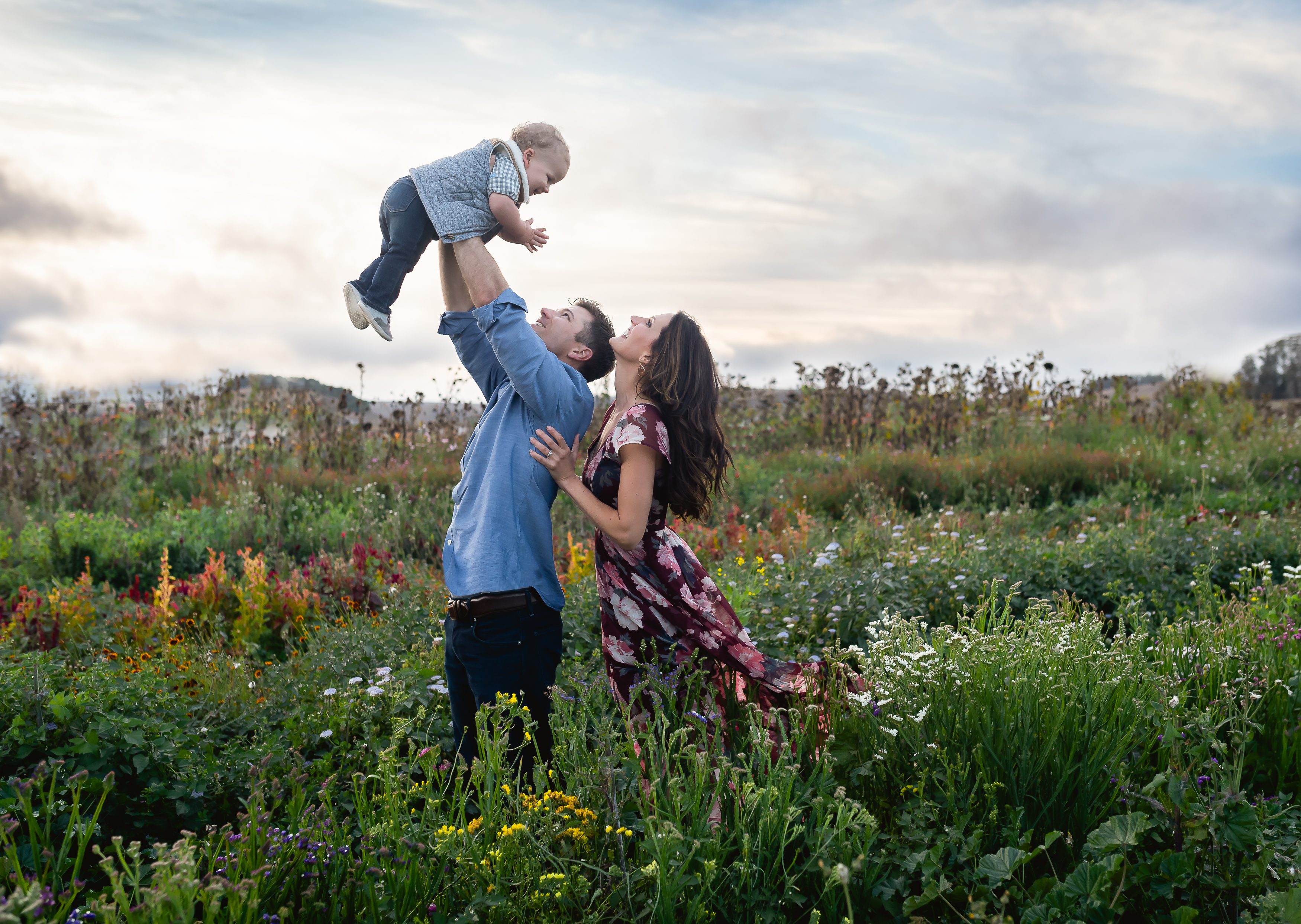
“Coordinate but don’t match. When styling a session, I like to start out with a basic color palette and go from there. You can do this with a neutral and a few colorful brights, or try a softer palette that has different tonal ranges of the same shades. Pick out a few color pops to coordinate between subjects when working with a palette of softer tones or neutrals.
Patterns are good – in moderation! Patterns can add visual interest and texture as well as a good dose of personality. Just make sure that either just one person is in a pattern with the rest of the subjects in simple, more solid color pieces or the patterns are subtle and complementary (for instance, a teeny tiny polka dot tie on a little boy next to his sisters bold color blocked pattern can look very complementary).
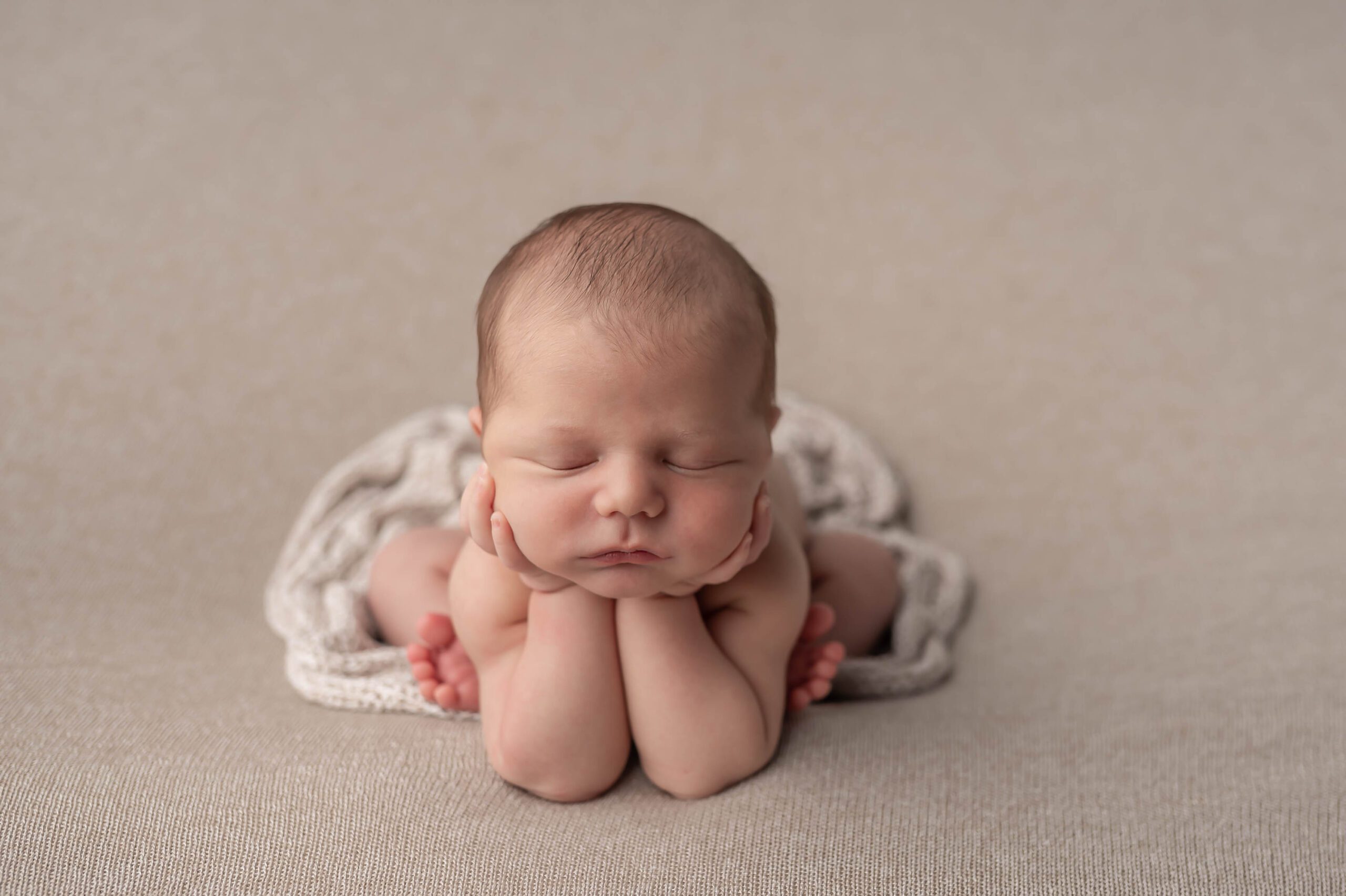
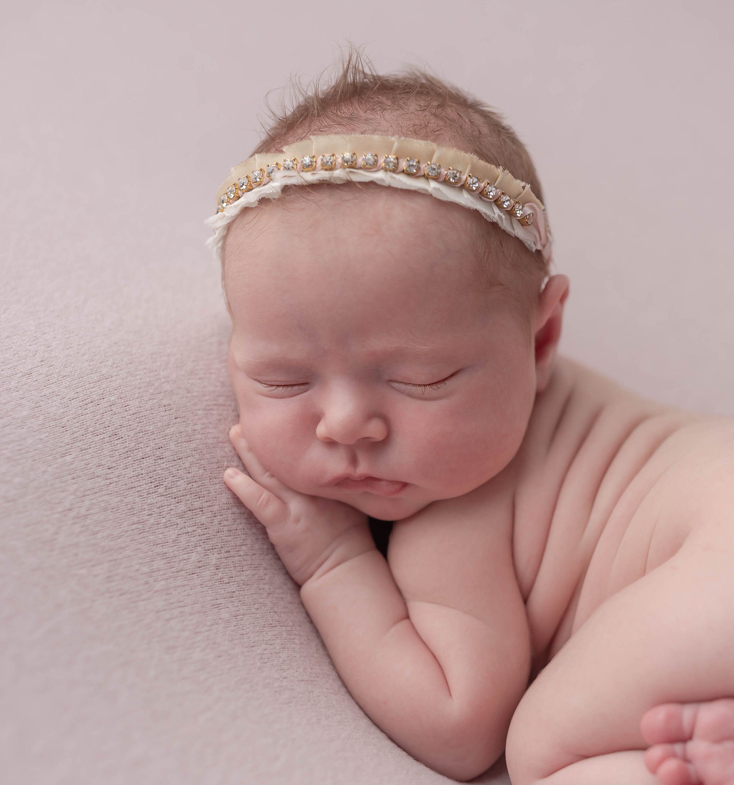
Layers and textures are beautiful and create interest in photos. I absolutely love using multiple textures and layers, especially important when working with a color palette a bit on the neutral or softer side (with a subtle color pop here or there). When I say textures one of the ways to achieve this is with different clothing materials and accents – tweed, crochet and embroidery details, lace, hand knit items, smocking, ribbons, ruffles, etc. Also, having different layers of clothing and accessories can add another dimension to the overall texture of the image.
Think about subtle props that blend with the the vibe of the session as well, but keep them simple and meaningful. A handful of flowers that are a natural, neutral color or that coordinate with color pops in the subjects’ clothing … a vintage camera … a basket of apples … or the absolute best type of prop is something that is meaningful to the subject (grandpa’s vintage camera, their favorite stuffed animal, a quilt made by great grandma, the family’s beloved pet). But don’t let the prop be an odd distraction – make sure it “makes sense” being in the photo and blends well with the whole vision you had in mind for the shoot.
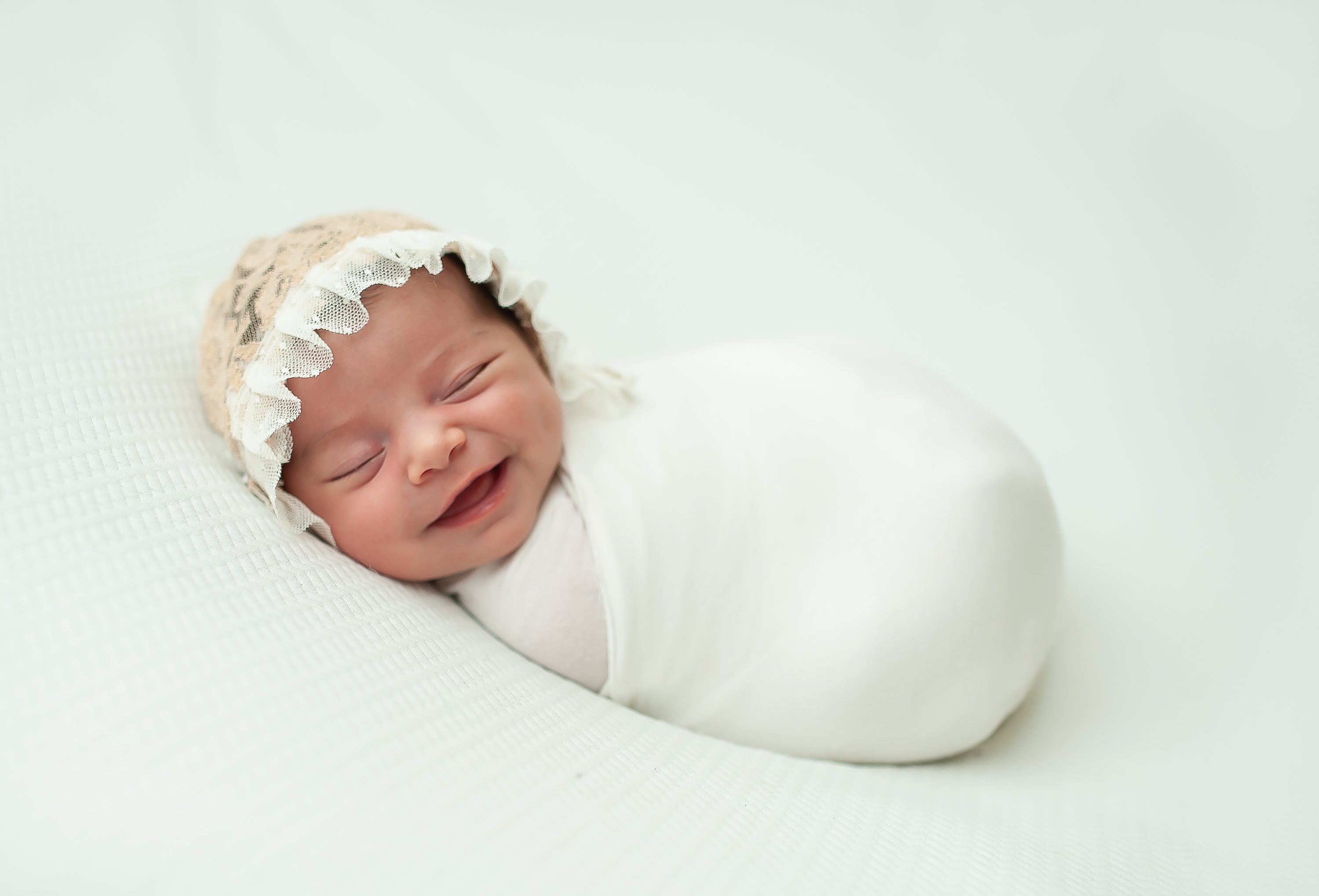
This is more of a personal choice, but I tend to choose clothing that is timeless … but whatever is your style, make sure your choices won’t look terribly dated years from now (or months in the case of some quickly passing trends). I personally love to use softer or neutral tones (with a color pop here and there) and classic shapes, then add interest with accessories, layers and lots of interesting textures. I also happen to love bright and colorful as long as it’s not obnoxious or distracting from the subject’s personality and face. Of course, this is a personal choice and many families will choose to go all out in the latest trends, thinking of their clothing choices as a sort of time stamp in their images.
Get comfortable. Make sure that the children can move freely in their outfits and that they aren’t going to be pulling and scratching at their new clothes … you want them happy and comfortable, not grouchy and miserable during the shoot! This means letting them have some input in what they wear. Kids who help dress themselves will not only be much happier campers when shooting time comes, but you’ll let their own beautiful personalities shine through in the images. Also, try not to make kids change outfits more than a couple times – another reason all those layers and accessories can be handy. The same goes for you – make sure that you select an outfit that makes you feel stunning and relaxed.
A few things NOT to do … many of them obvious no-no’s but important to include again as a refresher.
• Avoid anything with logos, graphics, characters, labels, etc. These tend to take the “finished” look of a professional portrait down a few notches, can be distracting (who wants people to first notice the Nike or Gap logo before the adorable little kid’s smile?) and will date a photo quickly. Note: There are a few instances where a more stylized graphic on a shirt can look good if it fits the vibe of a photo.
• If anyone is needing a trip to the salon, be sure to let the hair cut grow out a week or so in order to look most natural.
• Don’t make everyone wear all the same color … matching is boring and dated. Coordinate colors and looks, letting everyone have their own spin on the color palette (and every person does not – should not – have every color used in the color palette). And please no families all dressed in khaki pants, or all in denim and white shirts.
• While trying to stay current and fashionable, do avoid obvious trends that will be dated soon. You can do fashion forward while still remaining timeless.
• No bright white socks and no sneakers unless we’re talking about something fashion forward and simple like Converse or Vans. And also be sure to remove watches or jewelry not complementary to the session’s look.”
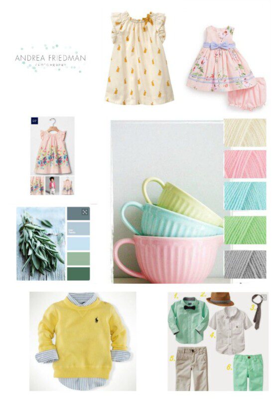
Here is a collage that I am using as a inspiration for my spring sessions:
Here you can read the full article from paint the moon and drool over her beautiful images
If you are looking for more inspiration follow my Pinterest inspiration board here .